Modelling Results
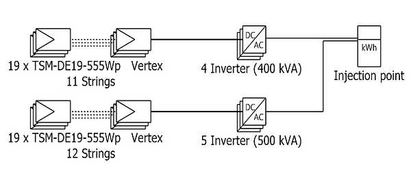
1. PV array characteristics

2. Energy Balances throughout the year

3. Available Energy
The graph represents the monthly energy production of a solar energy system over the course of a year. The y-axis shows the available energy in kilowatt-hours (kWh), while the x-axis shows the months of the year. The system is generating the most energy during the months of May, June, and July. This is because these months have the highest solar radiation levels, which means that the solar panels are receiving more sunlight and generating more energy as a result.

4. Available energy Vs Unused Energy
The graph represents the surplus energy generated by the solar PV system throughout the year which can be exported to the grid. It shows that the solar energy system is generating a significant amount of surplus energy during the peak months, which can be exported back to the grid and potentially provide a financial benefit to the system owner. During the months of November, December, and January, there is no surplus energy being generated since there is a lower overall production of energy during this period.

5. Energy balances and losses.
The stacked bar chart that shows the monthly energy production of a photovoltaic (PV) system, broken down into different categories. The y-axis represents the normalized production per installed kWp, which is the energy production per unit of installed capacity. The x-axis shows the months of the year. The stacked bar chart consists of four different colours, each representing a different category of energy production or loss.
Energy supplied to the user shown in red colour represents the amount of energy that is consumed by the user. System losses shown in a green colour represents the energy losses that occur within the PV system itself, such as losses due to inverter inefficiencies or wiring resistance. The collection losses shown in purple colour represents the energy losses that occur due to shading or other obstructions that prevent some of the sunlight from reaching the PV panels as well as module mismatch. Unused energy shown in blue colour represents the energy that is produced by the PV system but not used by the user, but it is fed back into the grid.
By breaking down the energy production into these different categories, the stacked bar chart provides insight into the efficiency and performance of the PV system, as well as any potential areas for improvement.

6. Performance ratio and solar fraction
The graph that shows the solar fraction (green) of a photovoltaic (PV) system and provides an insight into how much of the energy needs of the user are being met by solar energy. The graph shows a higher solar fraction for the PV system during the summer months, and a lower solar fraction during the winter months. This is because during the summer months, the amount of solar energy that is available at the site is typically higher than during the winter months, due to the higher angle of the sun and longer days. This means that the PV system can produce more energy, which can increase the solar fraction.

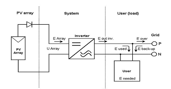
7. System operation diagram
The simplified sketch of operation shows that the system generates electricity from solar energy using PV panels and then converts the DC power into AC power that can be used by the user. When the PV system generates more electricity than is being used by the building or facility, the excess energy is sent back to the grid. The grid connection also provides a backup source of power for the user if the PV system is not generating enough electricity, such as during periods of low sunlight or during the night. When this happens, the user draws power from the grid as needed.
7. System line diagram